Meeker Cyclery
BRAND IDENTITY – LOGO MARK
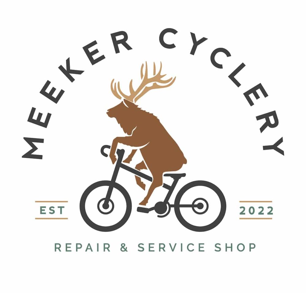
The logo was hand drawn, edited in Procreate, and finalized in Illustrator.

The owners wanted to stand out and were open to a humorous comp option I came up with after doing research and finding out that Meeker, Colorado is well known for hosting one of the largest elk herds in the world.
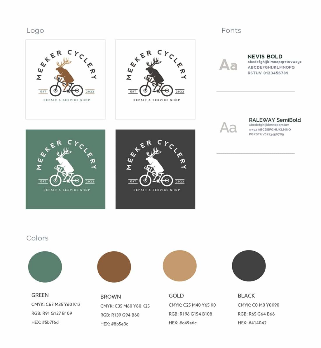
Their demographic was gender neutral, Colorado locals or tourists into serious biking. Colorado is a healthy state and is saturated by clever nature designs. Having seen enough standard bike & nature graphics, the elk on a bike throws a laugh out there, and sparks intrigue to find out more about this company. It’s inviting and casual but hints that they can repair anyone’s bike, even the locals (in this case, the elk). The curve of Meeker Cyclery font hints of a bicycle wheel or a curve of the mountain. EST. & 2022 create lines on the road for the elk to follow. The colors were chosen to resemble nature. San Serif was selected for a crisp easy read and cleaner lines, as the elk is detailed.


Final Result
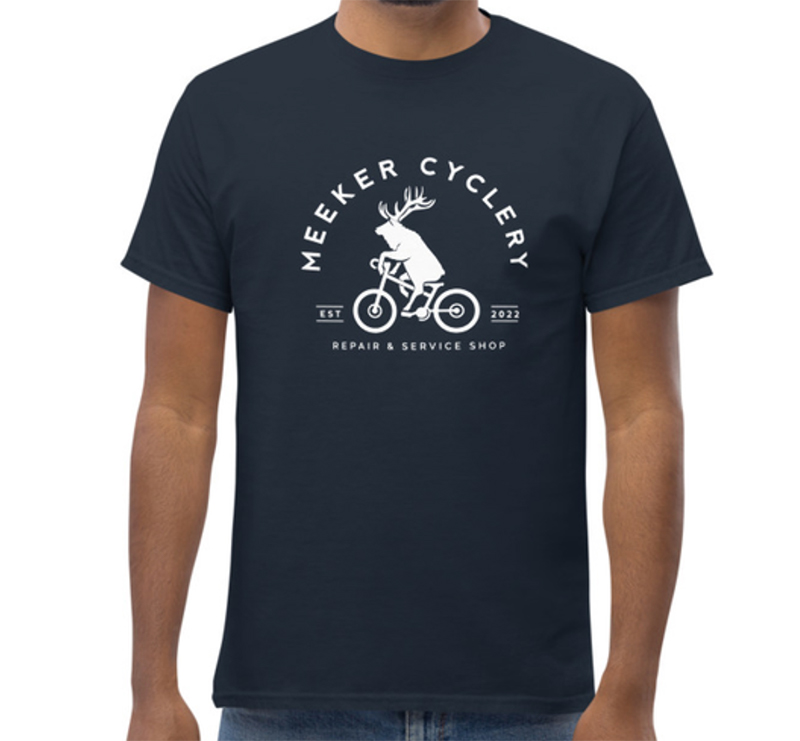
A clean clever logo that fits the healthy laid back Colorado mountain vibe, hits the funny bone and easily transitions onto t-shirts & sticker designs.

