Vine Street Real Estate
BRAND IDENTITY + LOGO MARK + WEBSITE + BC
Doing real estate differently

The client is in a highly competitive region in Denver, Colorado, and was looking for a very out-of-the-box Real Estate logo. She initially served in a boutique firm and wanted to keep an edge that stood out from the crowd. Her personality is genuine, and her goal was organic growth which is mimicked in the logo.
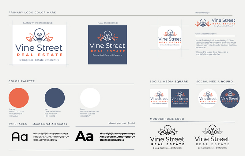
Due to the more professional, serious nature, I went against the standard green nature vibe. The navy lends stability and seriousness, while the secondary color, orange, can stimulate and encourage you to take action. The curves of the font Montserrat Alternates mimic the organic leaves and the word Vine.


START A PROJECT
Let’s Chat
I’m always interested in building new relationships and expanding partnerships.

